CreativeCrocs Branding
CreativeCrocs was meant to be a blog for the global in-house marketing creative team for Crocs. Comprised of designers and writers, managers and directors, strivers and oddballers, enthusiasts and dream-makers, locals and transplants, taco addicts, global brand strategists, get-it-right neatniks, print geniuses, and digital tinkerers, we the Crocs creative team knew how to get down with comfort.
The blog was to be a collection of what our team is doing, and what inspires us. It was designed to keep us engaged in each other’s lives, both professionally and personally, to whatever degree we were each comfortable with.
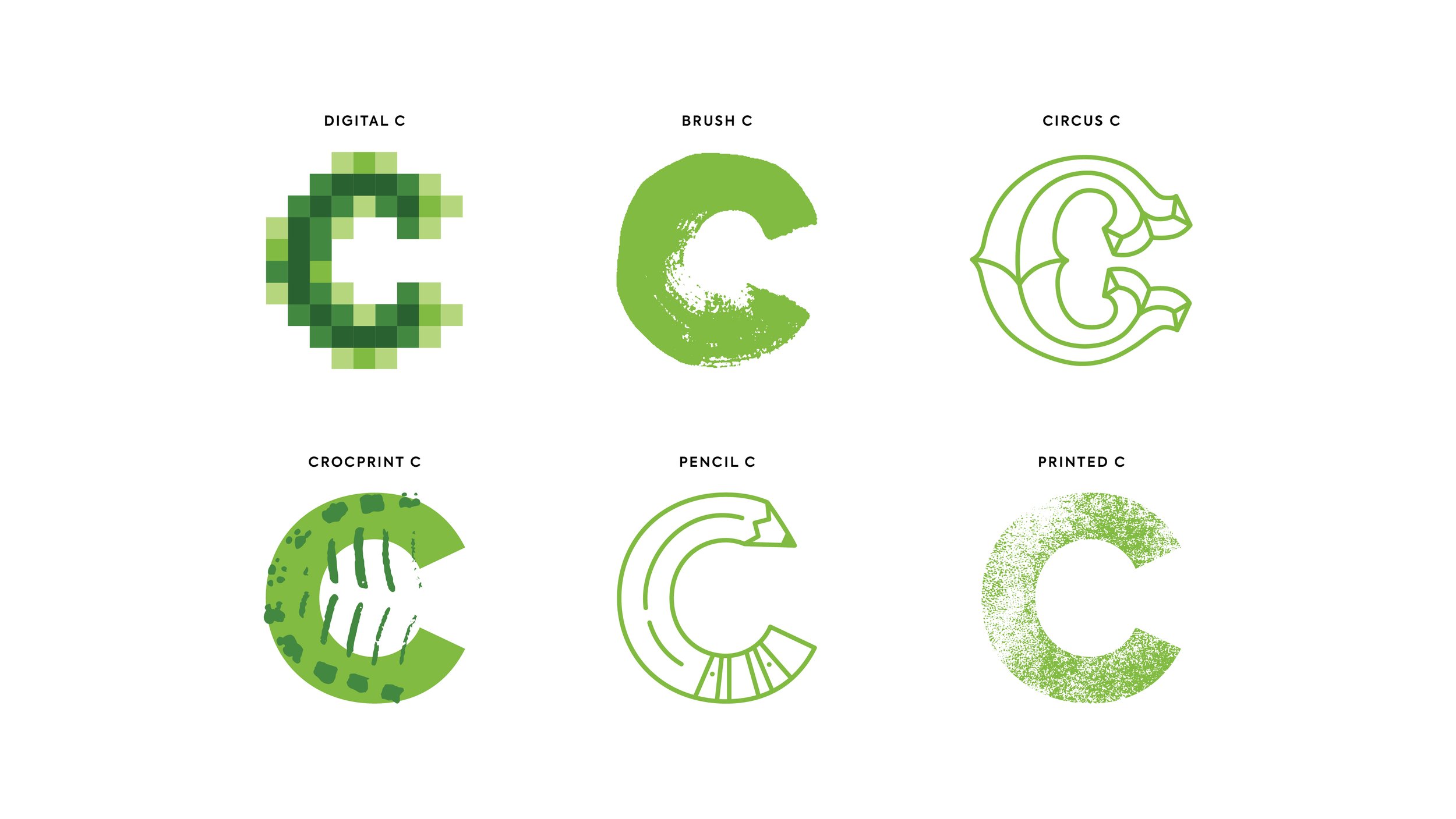
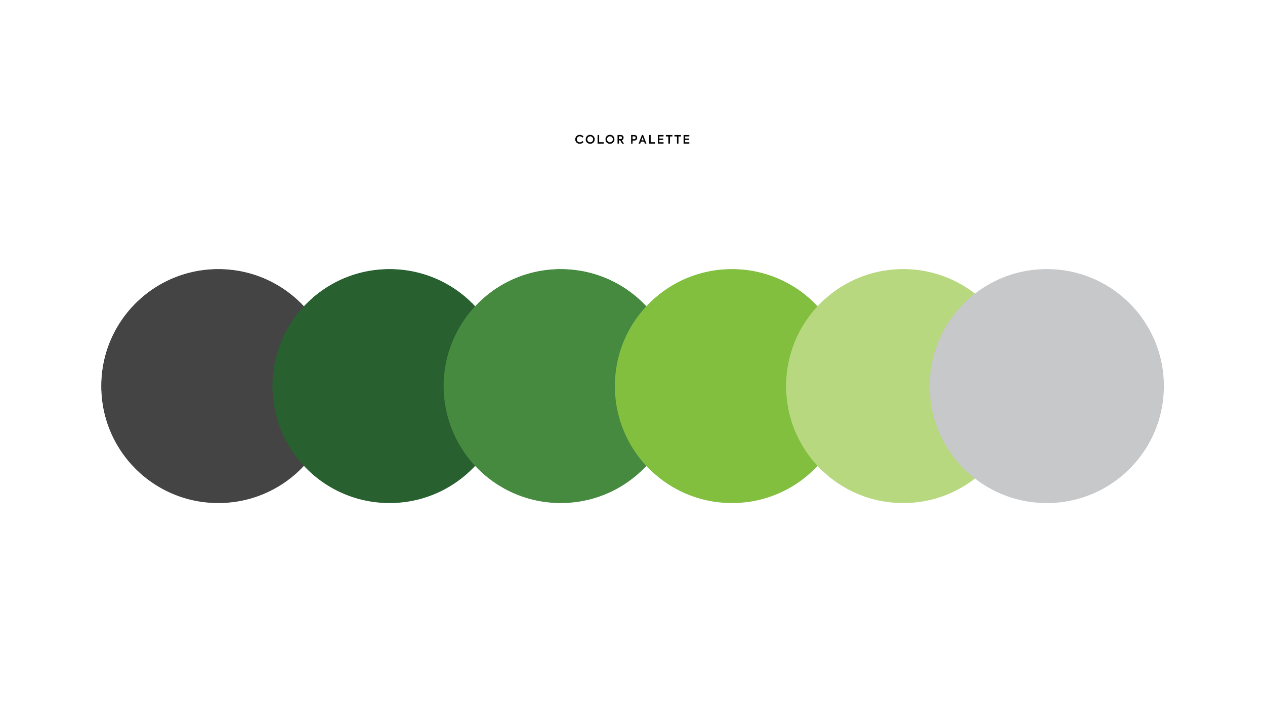
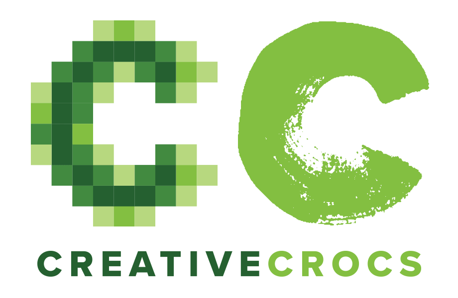
I created a logo inspired by the seemingly disparate yet somehow cohesive qualities that make us us. Comprised of variations of the letter “C”, our logo is a visual representation of the diverse skills and characteristics of our team. When possible, we’d use the animated logo, otherwise, we’d use the static version. The color palette is a monochromatic theme based on the Crocs core green. Grays have been added for contrast and depth.
Agency: Crocs in-house team, Creative Director: James Gardner, Designer: Dominique Barnes, Senior Copywriter: Chris Ransom
Scope
Logo Design
Branding
Color